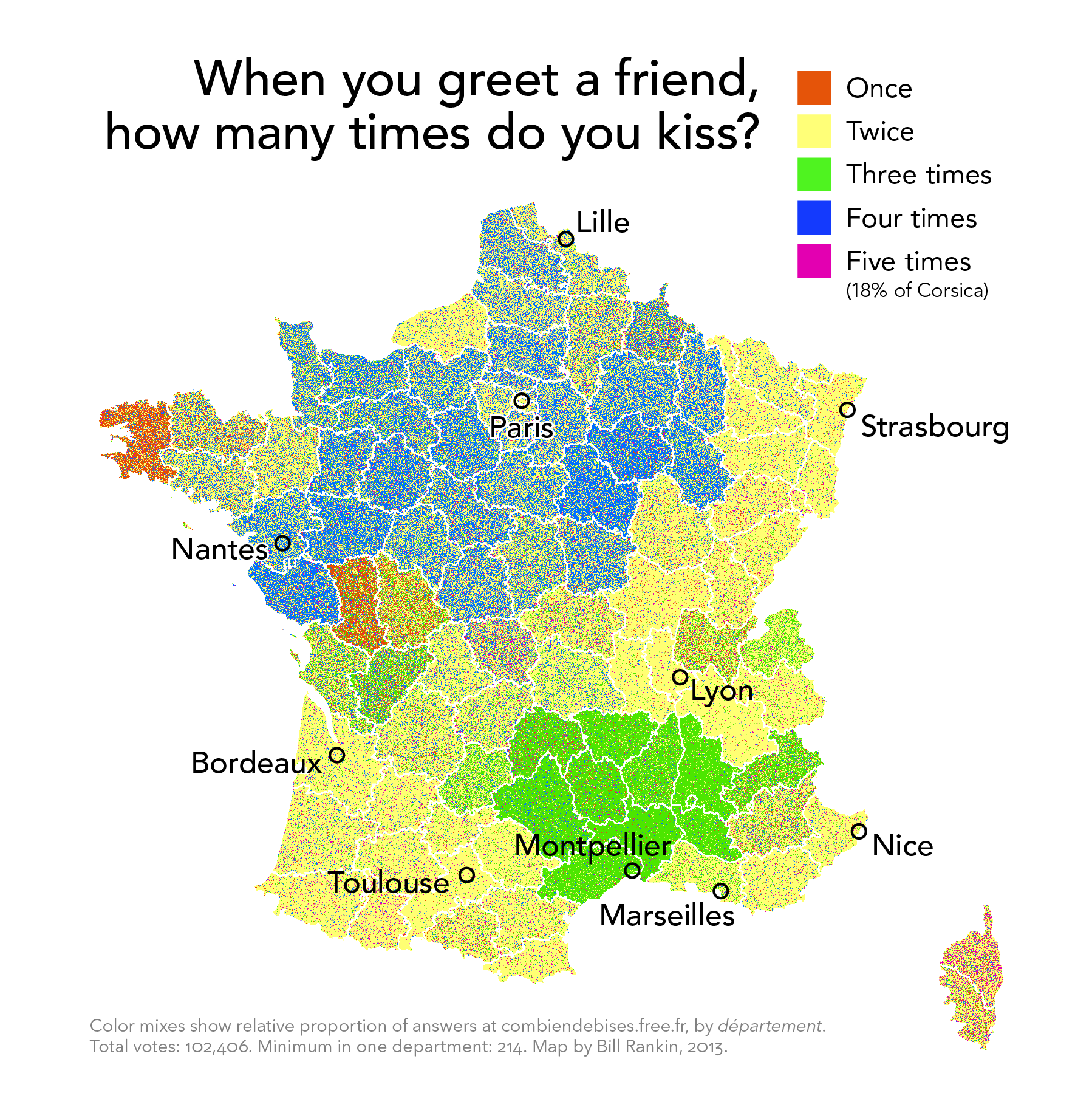
To us Americans, it's a custom that we are not as familiar with. But I like this map for another reason. If you look at it at the higher resolution, you can see how the cartographer used the various classes represented by different colors to paint this portrait of the topic of interest. While it is made up of many individual dots, they all come together to form a more descriptive picture with the variations and blends in color across the map. This is a lot like the impressionist era painting technique of pointillism, which as you would guess, comes from France.
Found
here under Browse by Problematic/Social Statistics/French Kissing
No comments:
Post a Comment