
Friday, February 28, 2014
Interactive Layers Map Example
An example of an interactive map that uses checkboxes to allow the user to select from a variety of layers to compare between them is the National Geographic Vital Statistics application - part of their Earthpulse program. The site lets users select from a variety of data topics regarding environmental science and human geography. While the map does not allow the user to position layers on top of each other as in a faux-GIS scenario, it does allow the user to switch between the layers through the use of a slider. That way, one can see the relationships between topics such as change in primary forest area and bovine consumption by country. Each data set has additional information on the topic displayed in the panel below the map space.
Tuesday, February 25, 2014
Animated Map Example
The data mapper utility over at the International Monetary Fund (IMF) website allows the user to select from a variety of data sets ranging from real per capita purchasing power adjusted GDP to ATMs per 100,000 population. The available data is then displayed for the countries of the world and the user is then able to select the years of interests as well as play through the years. The chorlopleth elements as well as a line chart showing the data of user selectable countries then change over time as necessary to reflect the data. The website is http://www.imf.org/external/datamapper/
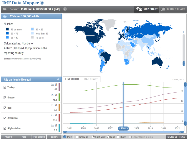
I find this utility interesting primarily because it is related to my field of interest, that being international economic development. Such visualizations make it easier for audiences to understand the data, necessary in the objective of convincing financing organizations and agencies to fund various development projects. It also gives the user a more global understanding of how different regions were affected differently over time.
I find this utility interesting primarily because it is related to my field of interest, that being international economic development. Such visualizations make it easier for audiences to understand the data, necessary in the objective of convincing financing organizations and agencies to fund various development projects. It also gives the user a more global understanding of how different regions were affected differently over time.
Saturday, February 22, 2014
Wednesday, February 19, 2014
Lab Three (an attempt)
After roughly six hours and continuously having issues with getting the stop(); function to work, there was only so much that could be done.
Monday, February 10, 2014
Timeline Map Example
I always had a fascination with historical maps, of how the boundaries of nations and States shifted over the course of history. For this week's example map, Timemaps has a plethora of interactive maps displaying the emerging, changing, and disappearing boundaries of the nations of the world. The link I posted goes to the page on Europe, partly because my favorite period in history takes place during the post-Roman world, to see all the different emerging and fragmenting kingdoms that come to fill the void of the Roman Empires.
Subscribe to:
Posts (Atom)