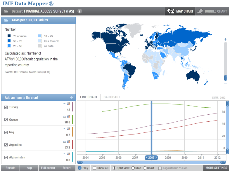
The data mapper utility over at the International Monetary Fund (IMF) website allows the user to select from a variety of data sets ranging from real per capita purchasing power adjusted GDP to ATMs per 100,000 population. The available data is then displayed for the countries of the world and the user is then able to select the years of interests as well as play through the years. The chorlopleth elements as well as a line chart showing the data of user selectable countries then change over time as necessary to reflect the data. The website is
http://www.imf.org/external/datamapper/
I find this utility interesting primarily because it is related to my field of interest, that being international economic development. Such visualizations make it easier for audiences to understand the data, necessary in the objective of convincing financing organizations and agencies to fund various development projects. It also gives the user a more global understanding of how different regions were affected differently over time.
No comments:
Post a Comment